Building mytokoto
A platform that connects users with verified car insurance agents in Indonesia, to revamp their brand identity and user experience. The project focused on building a cohesive visual and functional identity that stands out in the competitive auto-insurance domain. My contribution spanned across brand design, UI/UX for mobile-first responsive experiences, and a clear digital presence for insurance partners and agents.


14 Days
Delivered brand and UI assets
50+
2x increase
New insurance partner in first quarter
in Policy Purchases
Design Process
The design process began with in-depth discussions around brand positioning and user needs, followed by strategic visual exploration and prototyping. Brand identity development laid the groundwork for a distinct visual language, while UX focused on clarity and task completion for customers and agents.
Brand Identity
Direction
Design
Handover
Logo Design
Brand Guidelines
Competitive analysis
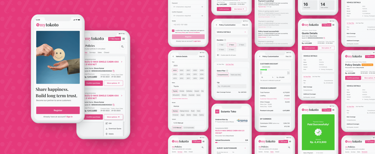
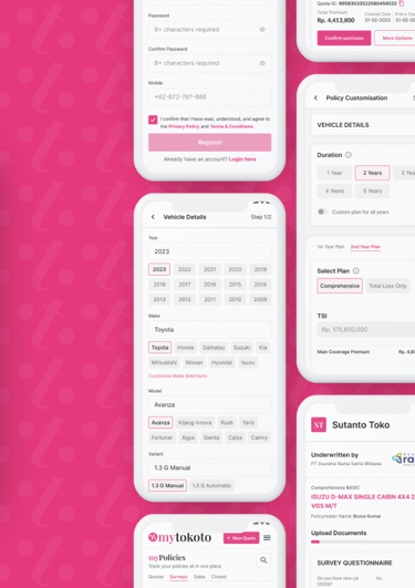
User Interface design for mobile responsive
UI Design handovers
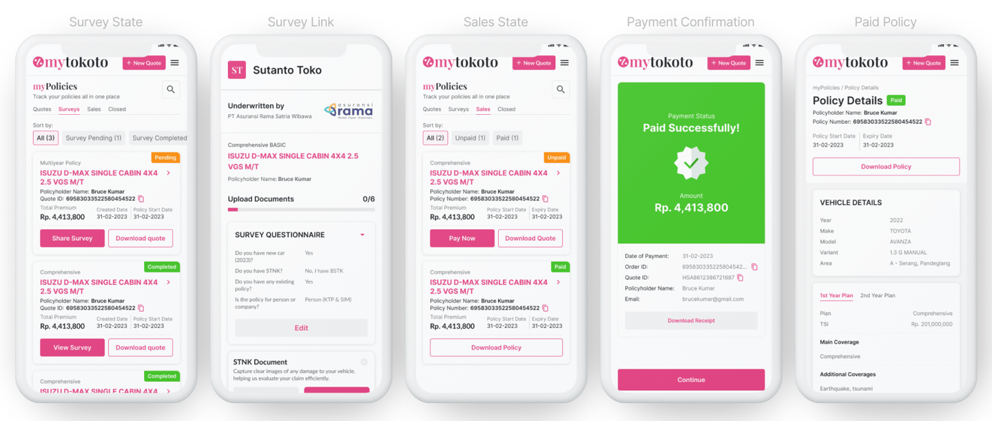
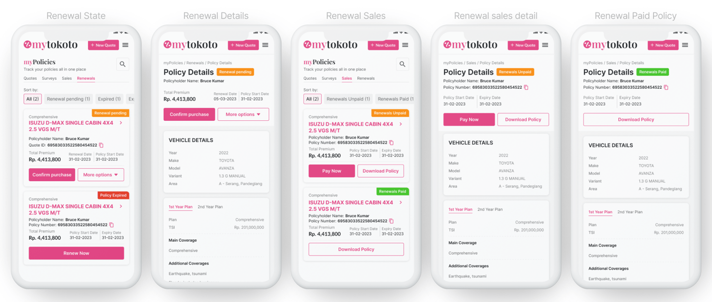
Business Flow
State Mapping
Visiting Card
Brochure for car insurance partners
Prototyping Flows
UI Themes & Styles


App icons & previews
Brand Identity
The brand identity for mytokoto was crafted to be modern, accessible, and reliable—mirroring its promise of trustworthy car insurance. I focused on designing a bold, adaptable identity system that reflects confidence and ease of use. The brand system extended from logo design to digital and print materials, ensuring a consistent tone and style across platforms.
Research on car insurance brand
To inform the design direction, I studied several existing car insurance logos, focusing on elements such as icons, type choices, and color palettes. This helped identify common trends like shields, cars, and tech motifs, allowing mytokoto’s identity to intentionally diverge and stand out by leaning into retail and affordability symbolism.
Logo Variations
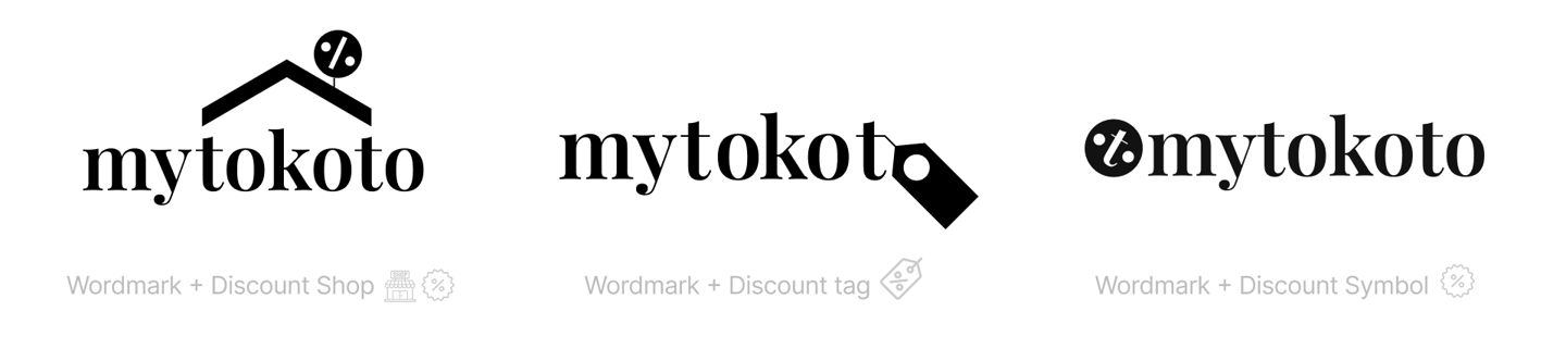
Multiple logo explorations were developed to test brand flexibility and relevance across digital and print formats. These included a wordmark paired with a discount shop icon, another with a traditional discount tag, and a more refined version where the letter "t" in the wordmark was subtly tweaked to resemble a discount symbol. This clever integration added a hidden metaphor within the type itself, reinforcing the brand’s focus on value and deals in a visually intuitive manner.
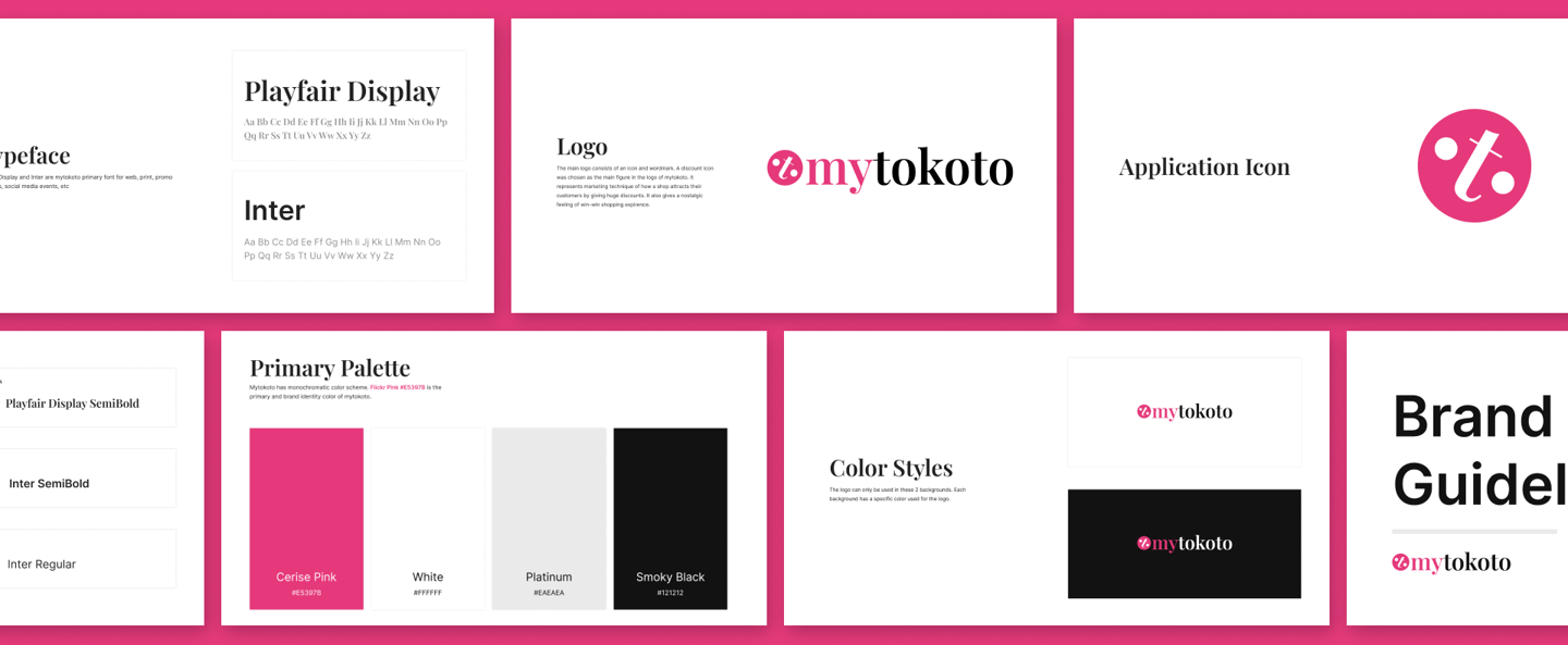
Font & Color Variations
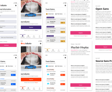
Several font and color pairings were tested to find the right mix of approachability and professionalism. The final selection used Playfair Display for headings to bring a sense of elegance and trust, complemented by Inter for body text for clarity and readability. The color palette included bold, high-contrast colors that ensured both digital vibrance and print accessibility.
Logo Design
The main logo for mytokoto consists of an icon paired with a wordmark. The chosen icon is inspired by a discount tag, symbolizing a strategic marketing technique where businesses attract customers with strong offers. This icon not only represents affordability but also evokes a nostalgic, win-win shopping experience—reflecting mytokoto's promise of value and trust in car insurance services. The overall logo design balances modernity with emotional relatability.
Brand Guidelines
Developed a detailed brand guideline document covering logo usage, colors, typography, iconography, and do/don’t rules to ensure consistent implementation by internal and external teams.
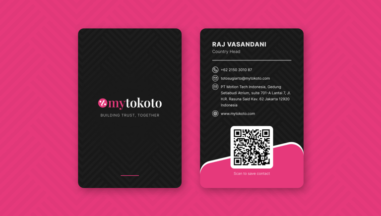
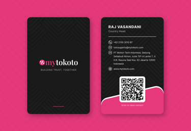
Visiting card
Designed a sleek and modern visiting card that maintains strong brand presence and professional appeal. Using a black base with subtle pattern texture, the front showcases the mytokoto logo with the tagline “Building Trust, Together.” The back of the card cleanly presents contact information, a scannable QR code for quick saves, and a unique wave element in brand pink—balancing corporate tone with visual identity.
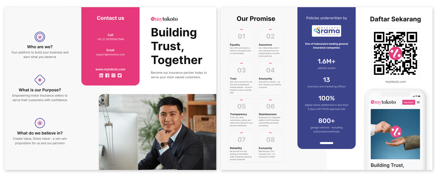
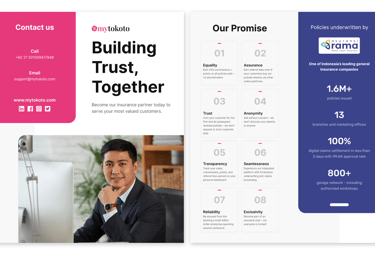
Brochure for insurance partners
Created a well-structured brochure to communicate mytokoto’s value proposition to potential insurance partners. The layout covers brand purpose, vision, and credibility, including core values like transparency, assurance, and exclusivity. It prominently features statistics such as 1.6M+ policies issued, 800+ garages, and a 99.6% claim approval rate. With bold pink and clean white sections, icons, and call-to-actions, the brochure is designed to instill trust while driving partnerships.
Direction
To ensure that the brand and product design aligned with business goals and market expectations, I began by establishing strategic directions through research, analysis, and early-stage design exploration. The direction-setting process included competitive benchmarking, mapping key stakeholder interactions, understanding business operations, and visual experimentation across themes.
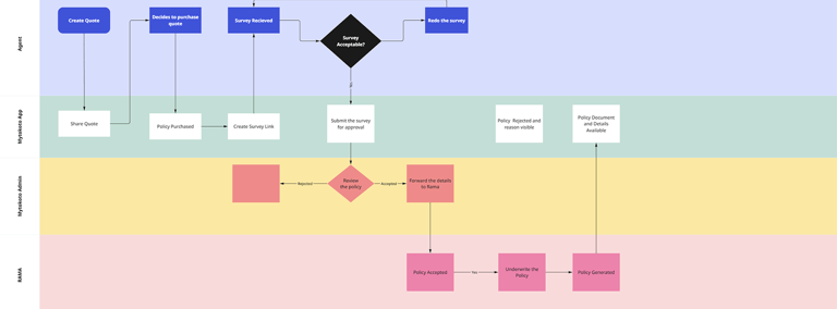
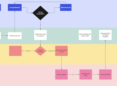
Business Flow
Mapped the full business flow involving agents, customers, and Rama (insurance provider), creating clear diagrams showing touchpoints, dependencies, and transitions to streamline product decisions.
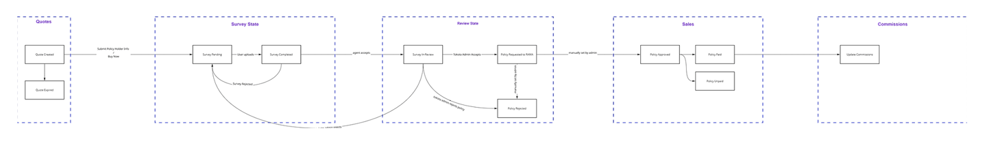
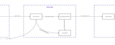
State Mapping
Visualized the lifecycle from insurance quote to survey to review to purchase. This state mapping helped align design logic, UI states, and notification triggers with real business operations.
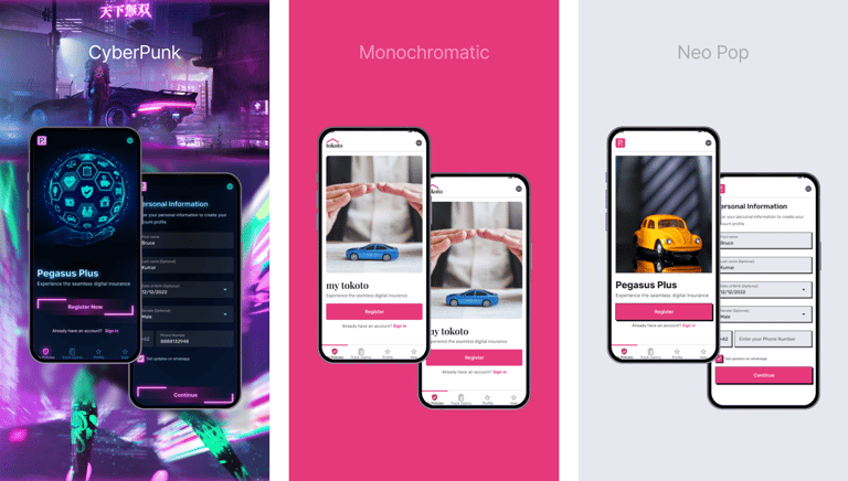
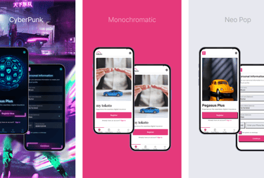
Exploring Themes
Explored multiple visual directions including a tech-inspired Cyber Theme, a clean Monochromatic Theme, and a vibrant Neo-Pop Theme. Moodboards and mockups helped finalize the direction best suited for mytokoto's brand tone.
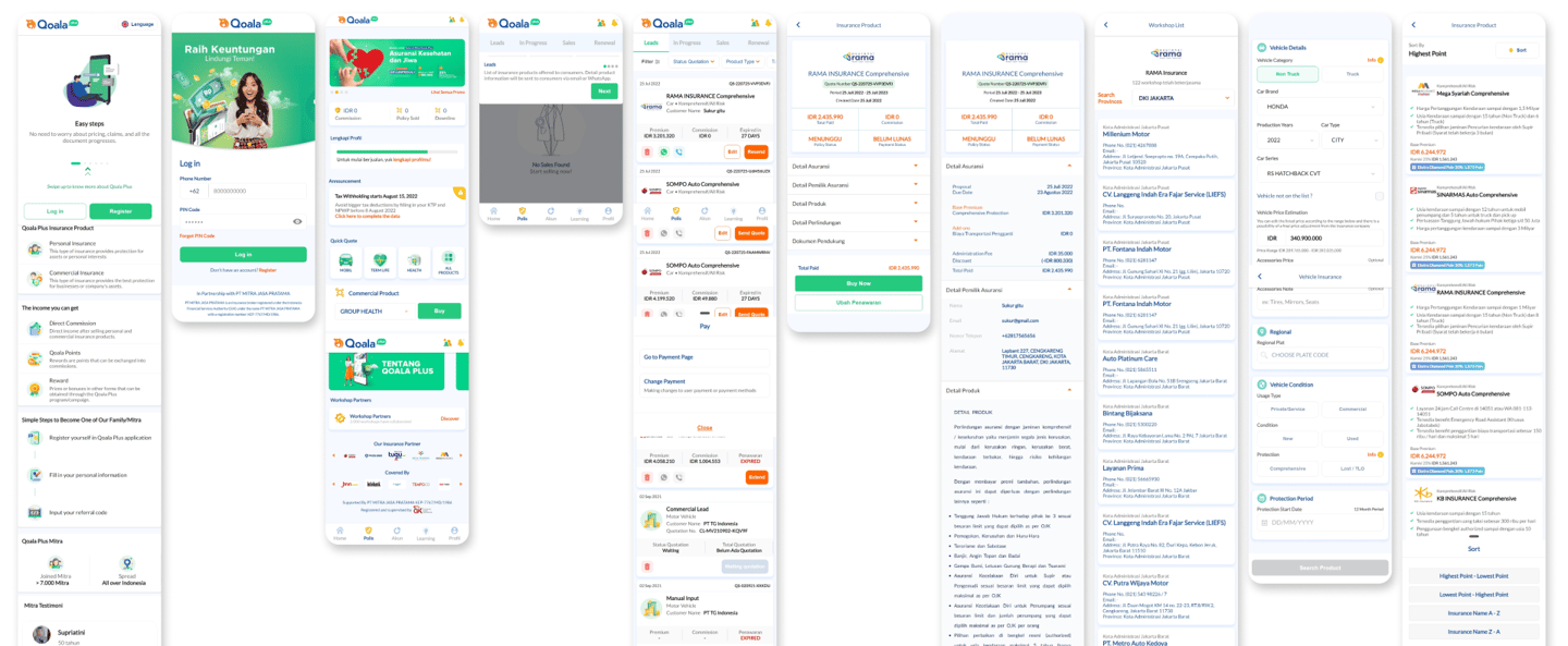
Competitive analysis
Conducted a UX and brand research of Quola Plus, identifying gaps in clarity, branding strength, and task flows. Used insights to make mytokoto more user-focused and visually distinct.
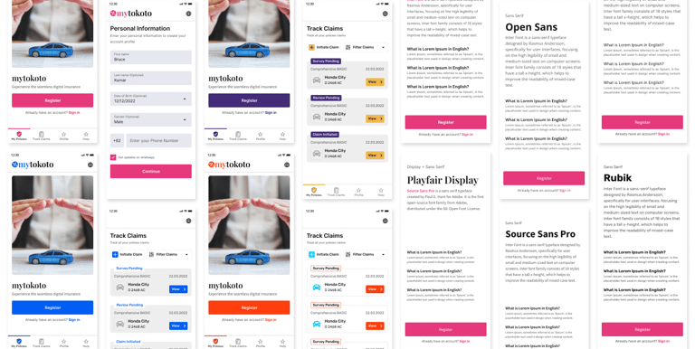
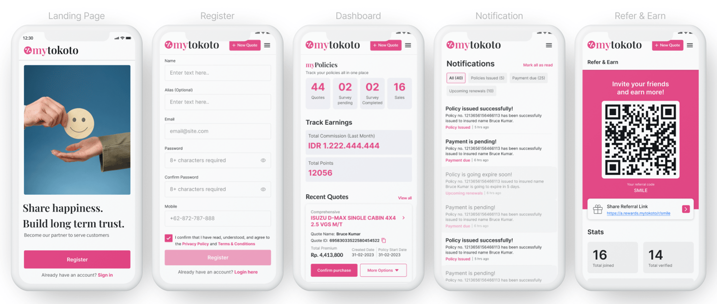
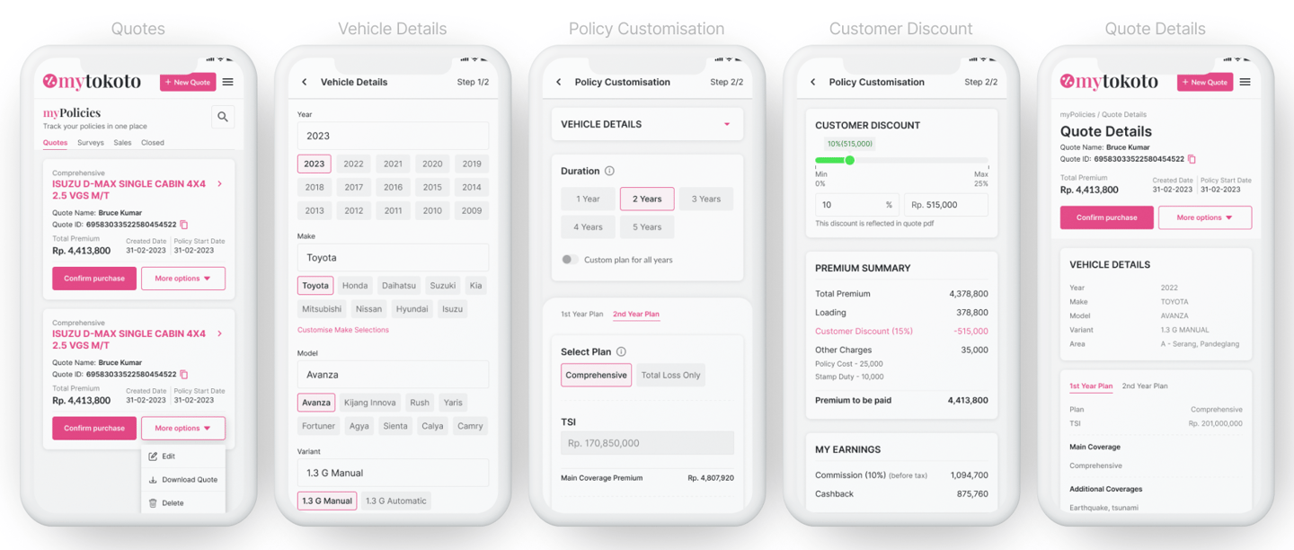
Design for Mobile Responsive
Designed a responsive web interface optimized for mobile-first access, including dashboards for agents, quote submission flows, and educational pages for users. The UI emphasized clarity, speed, and minimal input steps for better conversion.
Handover
At the final stage, all design deliverables were systematically organized and handed over to the development and marketing teams. This included UI prototypes for mobile responsive web experiences, app icons in various resolutions, app store preview screens, and other necessary brand and product assets. The handover was supported by well-documented Figma files, export-ready components, and brand usage guidelines to ensure smooth implementation.
Let’s connect
Feel free to reach out for collaborations or just a friendly hello 😀