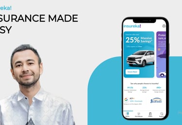
Customer Experience
As part of enhancing insureka!’s customer engagement across digital and physical touchpoints, I led the design of multiple sales and support experiences—from loyalty cards to exhibition booths and experience centers. The goal was to build trust, simplify insurance interactions, and make the brand more human and accessible.


800+
policy quotes generated via experience centers
1200+
150+
brochures distributed at booths and customer points
new leads captured through on-ground activations
Aim
To enhance customer trust, engagement and clarity in the insurance purchase and claim journey by designing a seamless and branded offline experience for insureka!
Problem Statement
Although insureka! had a strong digital presence, the offline customer experience lacked cohesion, emotional connection and brand recall. At key physical touchpoints—such as policy handovers, claim centers, exhibitions, and support booths—the customer journey felt fragmented, impersonal and unclear.
Solution
Design a comprehensive set of branded touchpoints—including loyalty cards, brochures, onboarding envelopes, exhibition booths, and experience centers—that turn insurance interactions into simple, approachable and trust-building moments. These assets aimed to translate insureka!’s digital-first values into tangible, real-world experiences.
The approach focused on translating insureka!’s digital-first identity into a cohesive and engaging offline experience. We mapped customer pain points across onboarding, quoting, and claims to inform touchpoint design. Every element—from loyalty cards to booths—was crafted to feel approachable, trustworthy, and useful. Visual consistency was maintained using insureka!’s brand language, while modular layouts, referral triggers, and on-ground activations were designed to increase interaction and lead capture. Real-time data and user feedback were used to refine materials and optimize effectiveness across touchpoints.
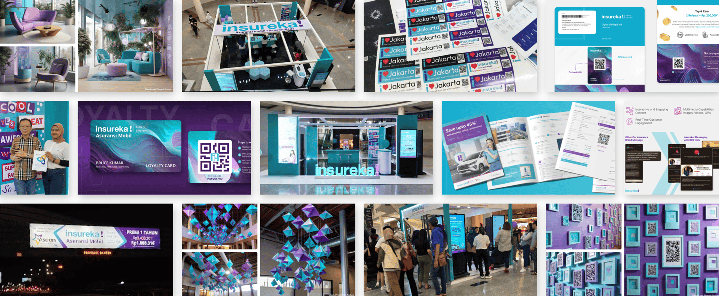
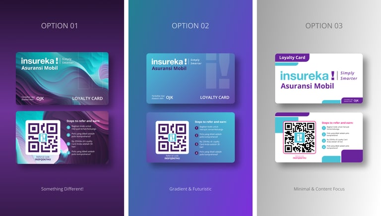
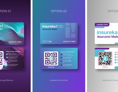
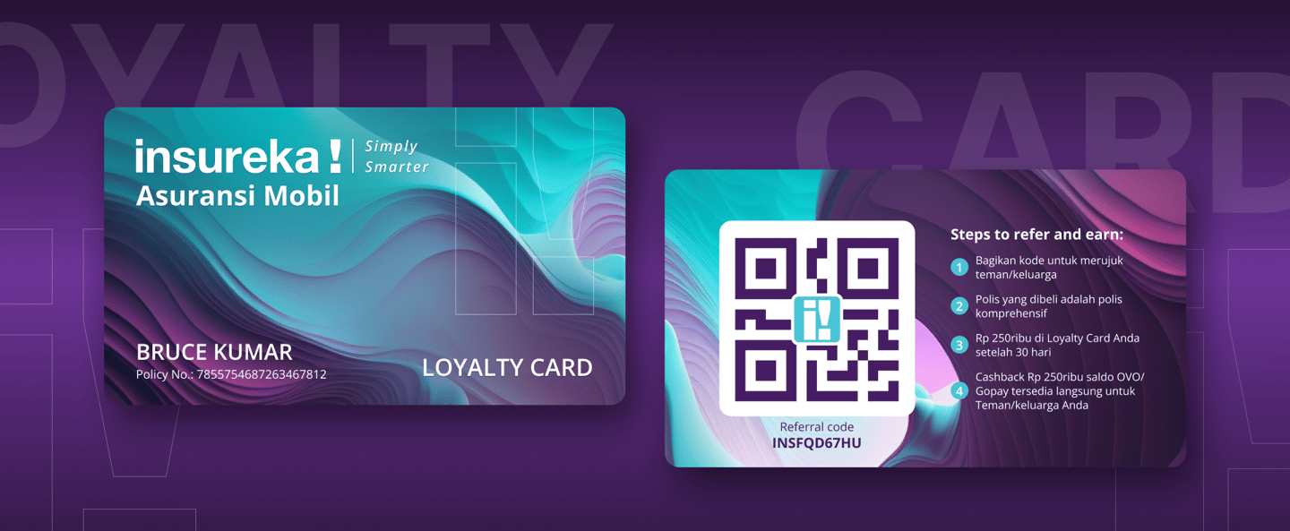
Loyalty Card
As part of insureka!’s customer onboarding and retention strategy, I designed a physical loyalty card along with a custom envelope, inspired by the look and feel of a premium credit card. This card is provided to every customer upon purchasing a car insurance policy.
Purpose
Reflect a premium, trusted brand — Deliver a delightful and memorable touchpoint during onboarding.
Highlight essential information clearly (Policy Number, Customer Name, QR code). Allows customers to initiate claims easily by presenting the card at any nearby partner claim center.
Includes a “Refer & Earn” code or QR to encourage customer referrals and reward loyalty.
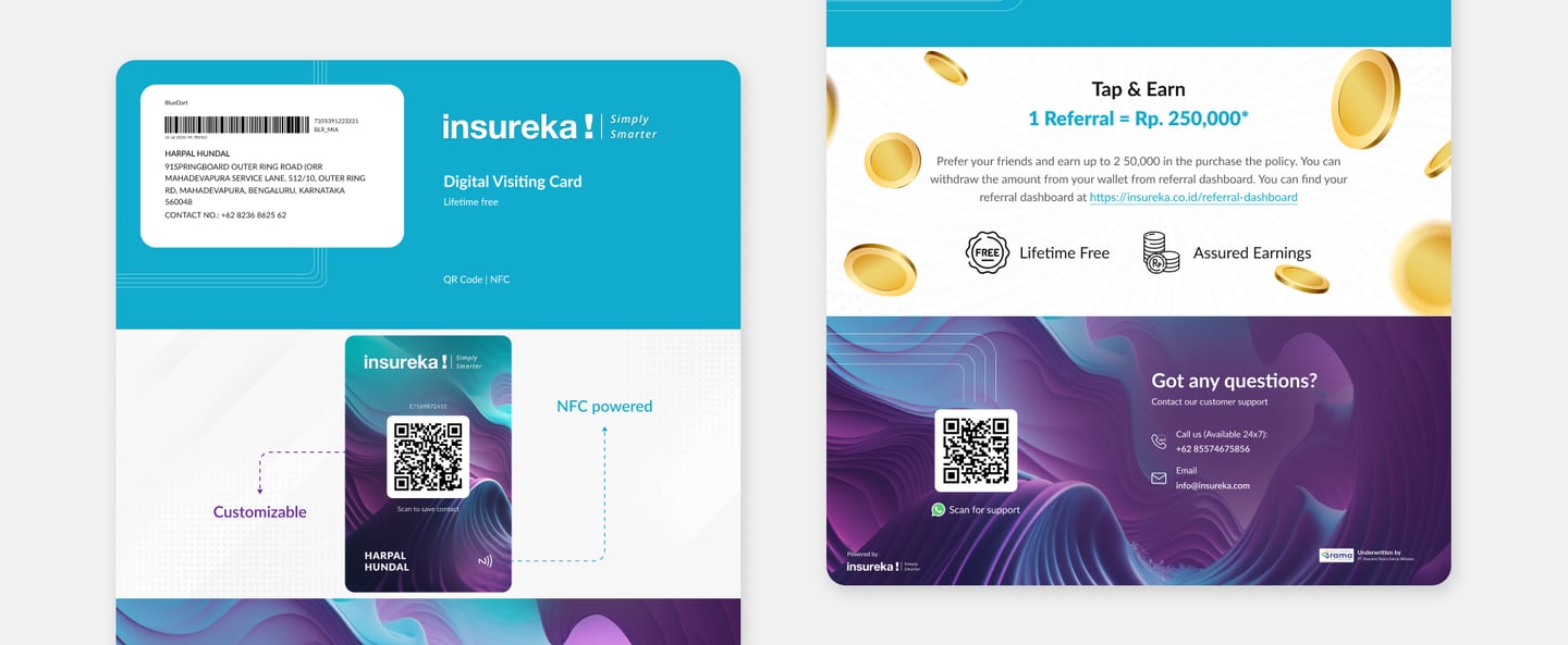
Tri-Fold Envelope
To complement the premium loyalty card, I designed a sleek A4-size tri-fold envelope that folds down to securely house the card, doubling as an elegant onboarding touchpoint. Inspired by clean, modern design principles, the envelope ensures a memorable unboxing experience while delivering essential information in a compact format.
The loyalty card and tri-fold envelope were designed to not only streamline insureka!’s onboarding process but also to elevate the customer experience by delivering a tangible sense of value, trust, and professionalism. By combining utility (for claim processing and referral benefits) with a premium unboxing feel, this touchpoint strengthens insureka!’s brand perception and fosters long-term customer engagement from the very first interaction.
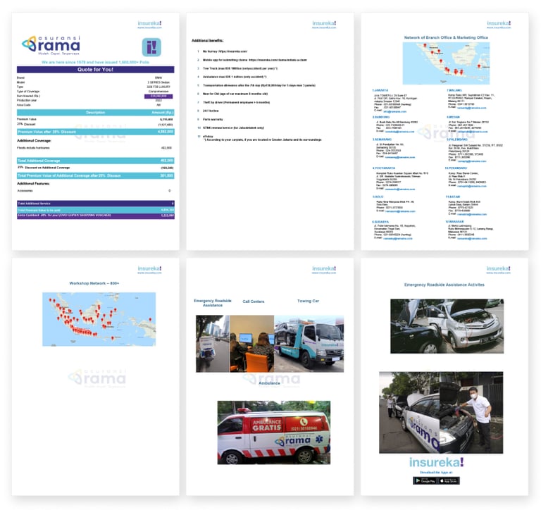
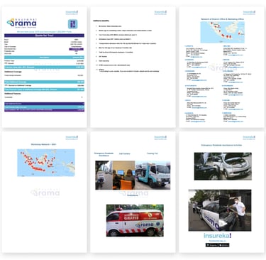
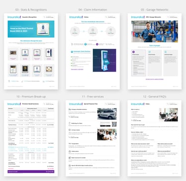
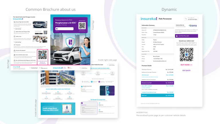
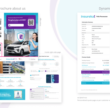
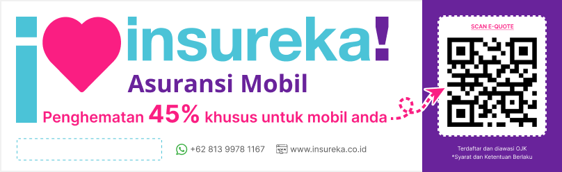
Policy Quote PDF
To support insureka!’s customer acquisition and policy clarity efforts, I designed a clean, easy-to-read PDF quote document that functions both digitally and in print. This quote serves as a critical touchpoint in the customer journey, helping users understand policy options, pricing, and coverage clearly before purchase. The design aligns with insureka!’s brand—modern, trustworthy, and customer-first.
Understanding existing PDF
The original quote layout lacked structure and clarity. It was heavily text-based, with poor visual hierarchy and minimal branding. Customers found it difficult to compare plan options or scan important details quickly. Additionally, it was not optimized for digital platforms, leading to a disconnected and confusing experience during a crucial decision-making stage.
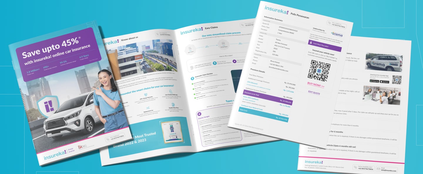
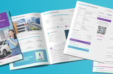
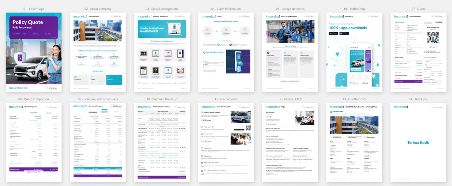
PDF Online Quote (Digital Version)
The redesigned digital PDF was structured for A4 viewing and optimized for readability across devices. It features clearly defined sections for pricing, coverage highlights, add-ons, and disclaimers. Visual elements like icons and highlight blocks make complex information more accessible. A scannable QR code or link directs users to complete their purchase or contact support instantly. The color scheme, fonts, and tone are aligned with insureka!’s digital ecosystem, reinforcing consistency across touchpoints.
Print Brochure — Compact Design for Print
To support offline sales, a print-friendly version of the quote was developed in a compact format (folded A4). It focuses on key decision-making info—plan names, premium amounts, benefits, and contact options—arranged in a visually appealing layout. The brochure uses clean grids, concise messaging, and brand visuals to deliver impact. Premium matte-finish paper was recommended to ensure a quality feel.
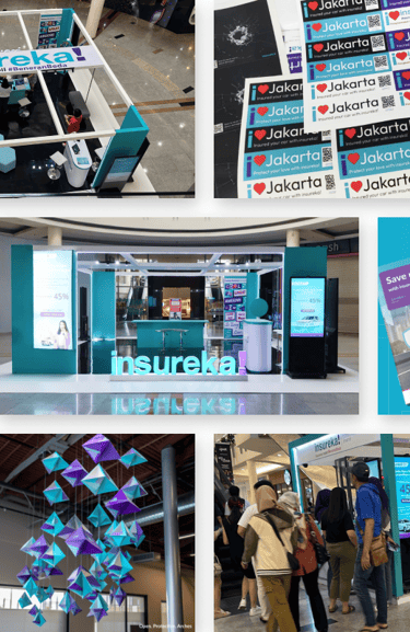
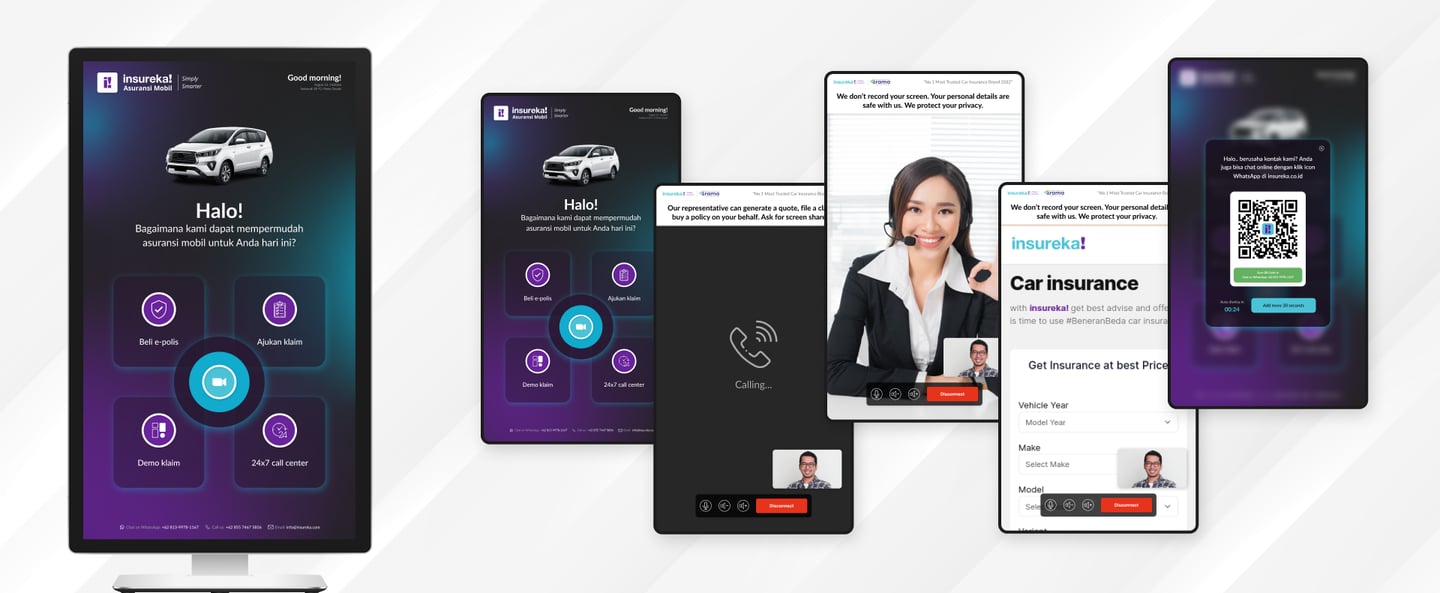
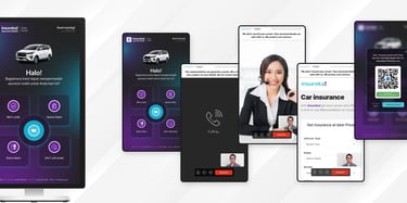
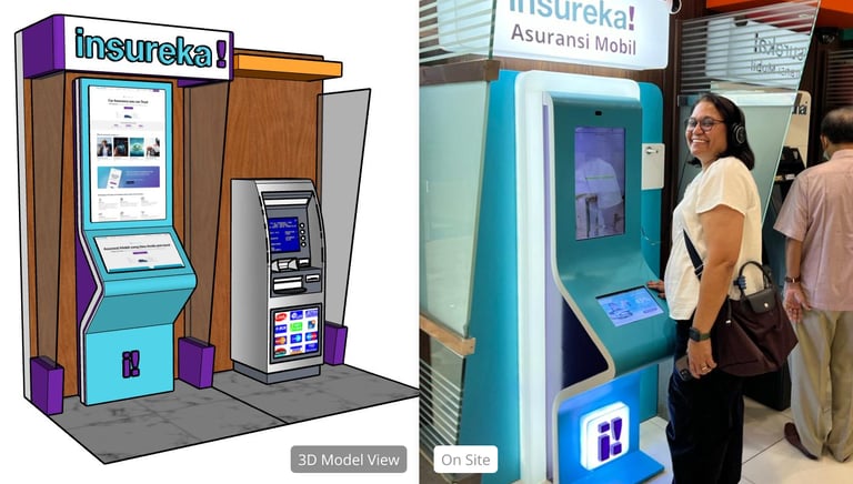
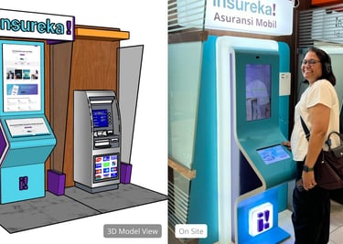
Experience Centers
To expand insureka!’s physical presence and create more touchpoints with customers, I contributed to the design of Experience Centers—a blend of retail-inspired spaces and branded claim support zones. These centers were envisioned to provide walk-in customers with a space to understand policies, get instant quotes, initiate claims, and experience the brand in a tangible, interactive environment. The design focused on visual storytelling, functional clarity, and delivering a frictionless experience through smart layout, digital integration, and marketing collateral.
Conceptualizing the Feel
Centrally placed exhibition booth was designed to maximize visibility and engagement within a high-footfall mall environment. The layout is open and inviting, encouraging visitors to walk through and interact with the brand.
The booth features a bold overhead banner with the insureka! logo and tagline, ensuring visibility from upper floors. The use of vibrant brand colors, modular hexagonal seating, and clearly defined service areas (quote desk, demo screen, information counters) enhances both functionality and aesthetics.
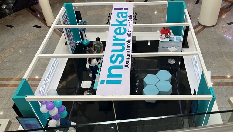
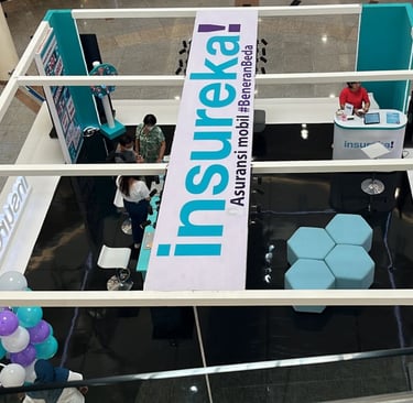
Standees were strategically placed at entrances and waiting areas, guiding users to act independently and save time. The visual design ensured clear calls to action, bold typography, and scannable elements that worked even from a distance. The tone was instructional yet friendly, helping users understand what to do next.
As part of the customer self-service flow, I designed standees that allowed users to: Get a quick insurance quote, simulate a claim process and 1 on 1 video call support.
Standee Design for Customer Interactions
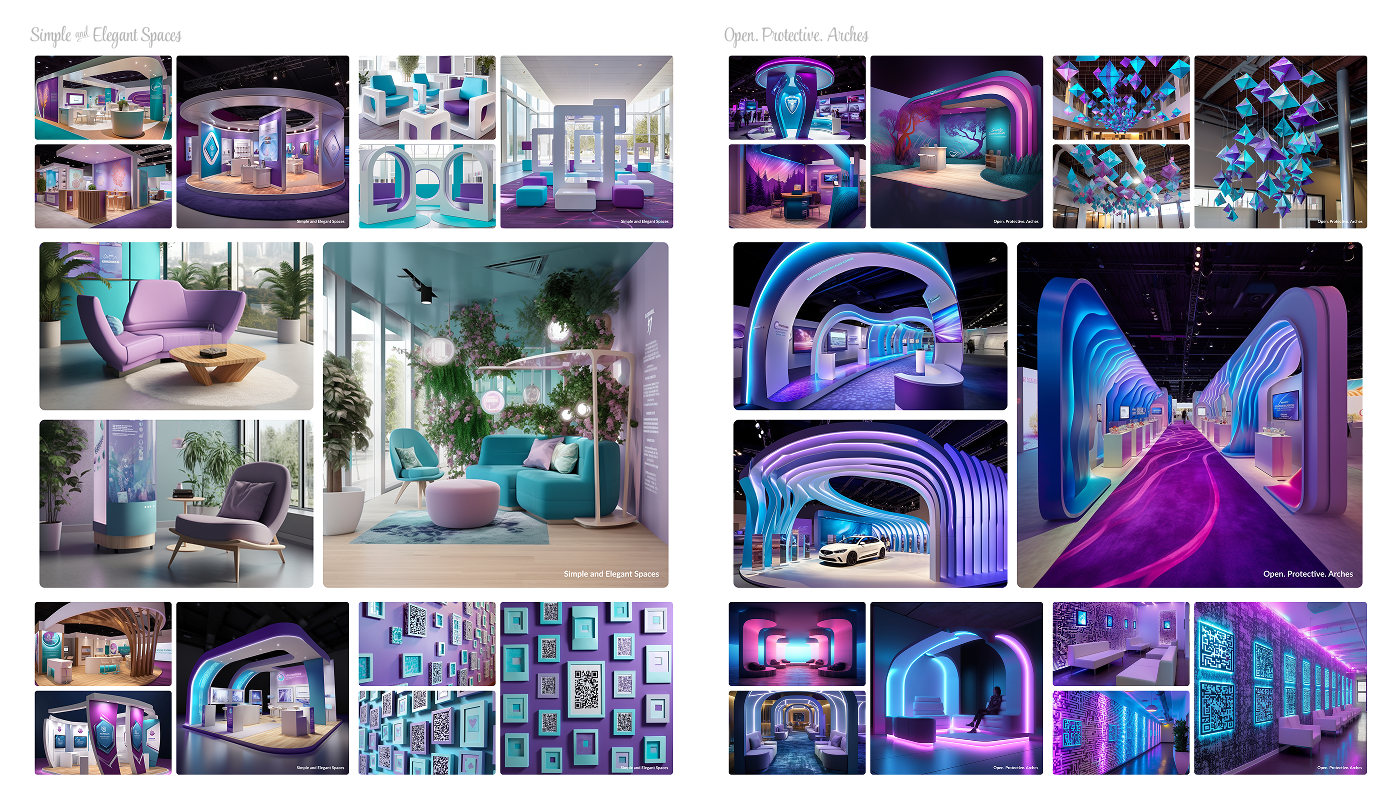
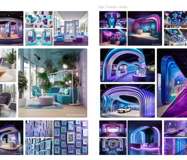
Concept Moodboard
The first was simple and elegant, using clean lines, soft tones, and modular layouts for a smooth, user-friendly experience. The second, "Open. Protective. Arches.", featured curved forms and open walkways inspired by the idea of safety and welcome. This concept was visualized using Midjourney AI to explore spatial moods and forms.
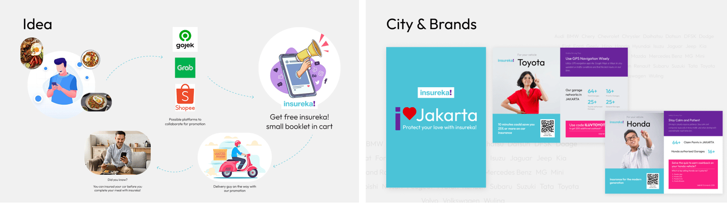
To strengthen the visibility of insureka!’s brand, we had designed claim point kiosks and marketing standees styled like modern ATM terminals.
These standees were strategically placed near ATM machines, guiding users to act independently.
The standees visually communicated ease of process, customer support availability, and to generate quote. Design-wise, they were consistent with other insureka! assets.
Standees for Marketing
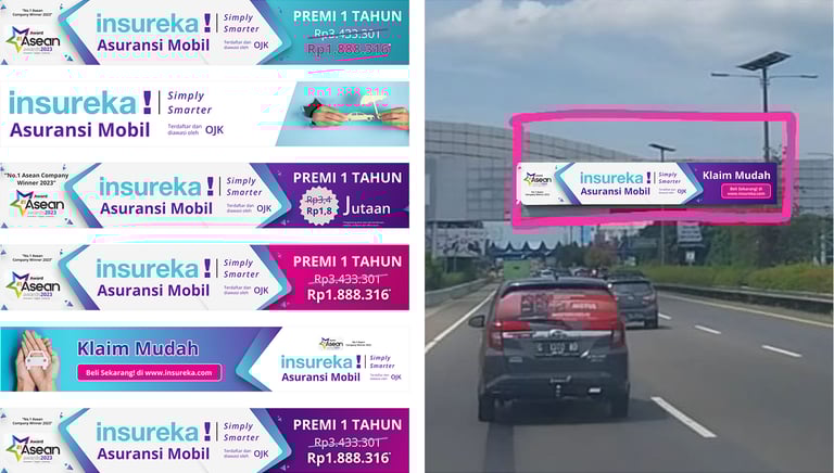
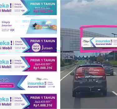
Bill Board
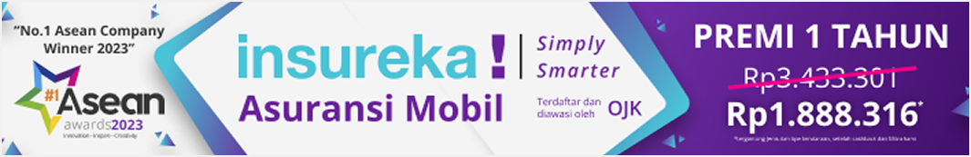
As part of a branding and marketing campaign for insureka!, a digital car insurance provider based in Indonesia, I designed a promotional billboard advertisement aimed at highlighting the company’s value proposition—affordable, smarter insurance. The goal was to combine trust-building elements with modern aesthetics to effectively convey the key messaging at a glance.
Variations
To ensure the billboard design effectively communicated its message across different environments and formats, I created and tested multiple design variations and real-world mockups.
Urban Billboard Mockups: The final design was placed on actual physical billboard sites to evaluate real-time readability, visual impact, and brand recall from a distance in high-traffic areas.
Color and Layout Experiments: Variants were tested with different background treatments, typographic hierarchies, and call-to-action emphasis to refine visual hierarchy and engagement.
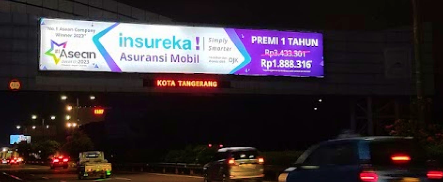
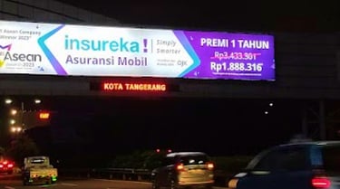

Final Design
The final design combines bold visuals with clear messaging, highlighting the discounted premium and insureka!’s award recognition. It maintains strong brand presence, trust elements, and high readability—perfect for roadside and digital display formats.
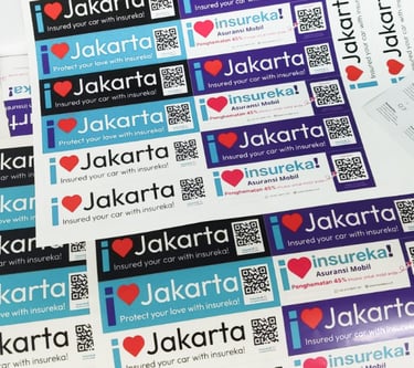
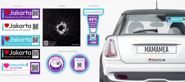
Stickers
To extend brand presence and customer engagement on the road, a set of playful, informative, and interactive car stickers was designed for insureka!. These stickers served dual purposes—spreading brand awareness and educating or assisting users with road safety tips, emergency information, and smart insurance features via scannable QR codes.
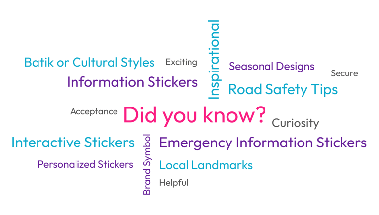
Brainstorming
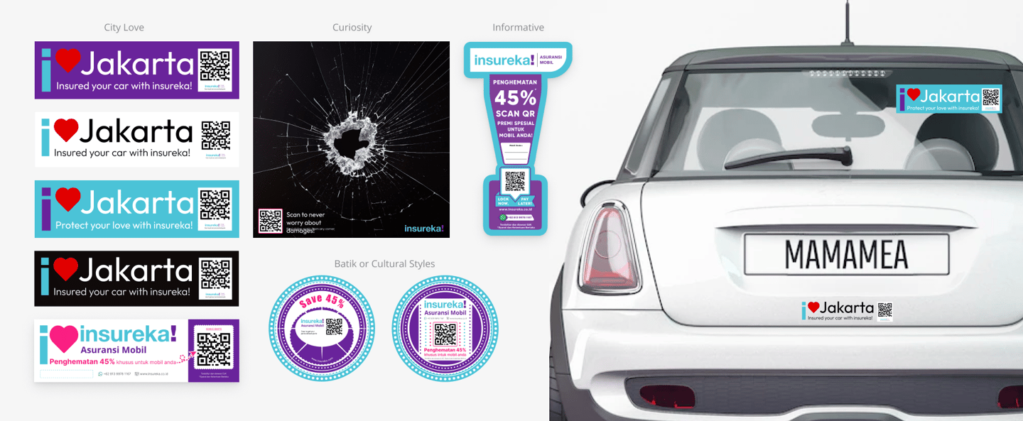
The ideation phase explored how to make insurance visible yet fun in everyday environments. Key themes included city love, safety awareness, emergency guidance, Batik/cultural patterns, and interactive stickers with QR codes. The goal was to balance utility, curiosity, and emotion, with styles ranging from friendly to bold. A word cloud and mood references guided creative exploration.
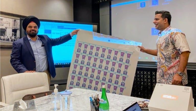
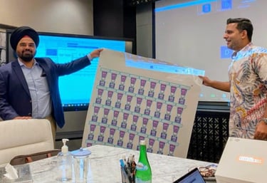
Sample stickers were printed and tested on actual vehicles to evaluate print quality, sunlight durability, and QR scan performance. Placement tests on rear windows, bumpers, and side panels helped refine scale and contrast for maximum impact.
Print Testing
Variations & Mockups
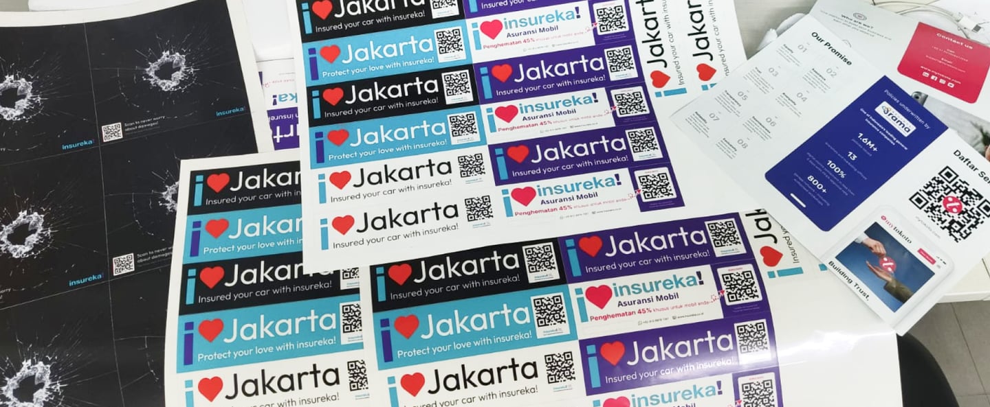
Several sticker variants were created, including “I ❤️ Jakarta” badges with QR codes, emergency-themed safety prompts, Batik-style cultural designs, and informative tabs for discounts. Each was tested on vehicles to ensure clear visibility, emotional appeal, and practical use on the road.
Final Selection
The final sticker set included a modular mix of city-love tags, safety reminders, cultural emblems, and functional QR-based tools—designed for both aesthetic appeal and customer utility. Bright colors, bold typography, and local personalization ensured the stickers felt joyful, relevant, and brand-aligned with insureka!’s approachable identity.
Additional Customer Engagement Concepts
A set of innovative ideas leveraging offline assets, AI-driven marketing, rich messaging, and interactive emails to boost user engagement and simplify the insurance experience across multiple channels.
Celebrity AI Marketing
Leveraging generative AI, we created hyper-local campaigns featuring digital celebrities to build instant trust and recognition. This approach helped localize messaging and make insurance feel relatable and modern to a younger audience.
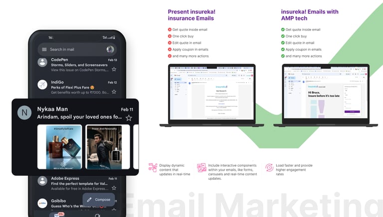
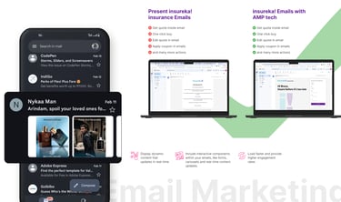
Using AMP technology, insureka! emails became dynamic and functional. Users could explore quotes, update preferences, and even start claims directly within the email—leading to better engagement and conversion compared to standard campaigns.
Accelerated Mobile Pages (AMP)
Booklet
The insureka! booklet was reimagined as a lightweight, engaging insert distributed through everyday delivery platforms like Gojek, Grab, and Shopee. By partnering with these services, the booklet reached users in a natural moment—while enjoying a meal—turning wait-time into a chance to explore insurance benefits. The content was designed to be instantly understandable and actionable, making insurance feel approachable and relevant, right at their fingertips.
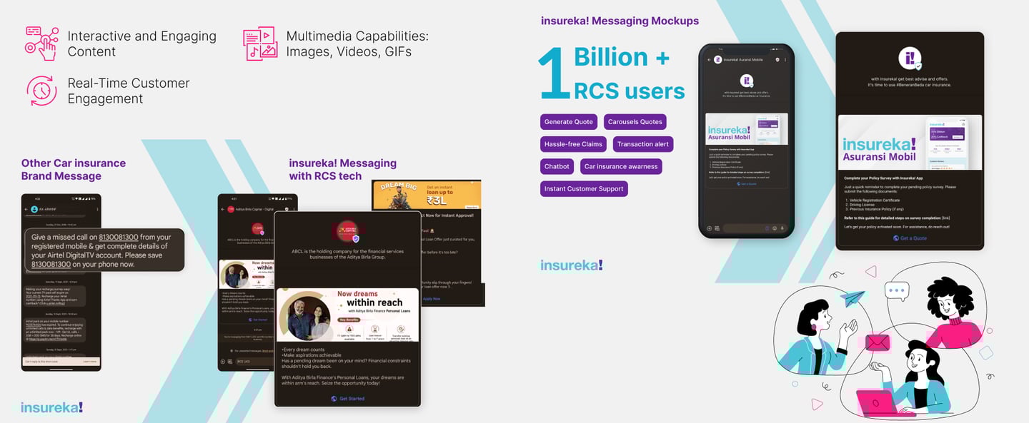
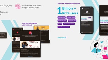
Rich Communication Services (RCS)
RCS was used to deliver real-time, engaging messages to users' default SMS apps. This allowed us to send images, videos, and quick reply buttons—making policy discovery, reminders, and claims more interactive than traditional texts.
Let’s connect
Feel free to reach out for collaborations or just a friendly hello 😀