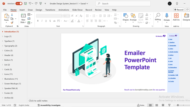
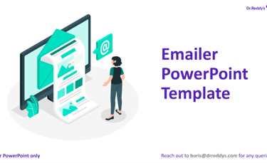
Emailer Design System
A customized, easy-to-use Emailer Design System built within PowerPoint to empower non-design teams at Dr. Reddy’s Lab. By streamlining emailer creation, we boosted productivity, ensured brand consistency, and significantly reduced the dependency on the design team.
100+
non-design stakeholders empowered


150+
ready-to-use design components
50%+
reduction in designer dependency
Problem Statement
Creating emailers previously consumed extensive time from our design team, often due to stakeholders' unfamiliarity with design tools like Figma. This led to delayed communications and misallocation of designer resources.
Solution
Design an intuitive and comprehensive Emailer Design System within PowerPoint, enabling stakeholders to independently create professional, branded emailers efficiently.
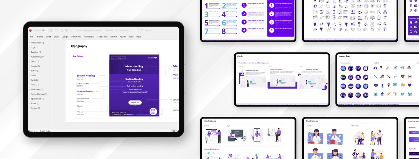
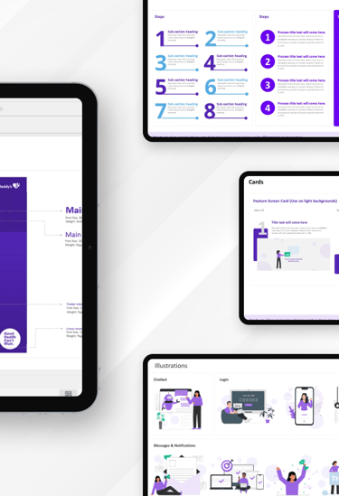
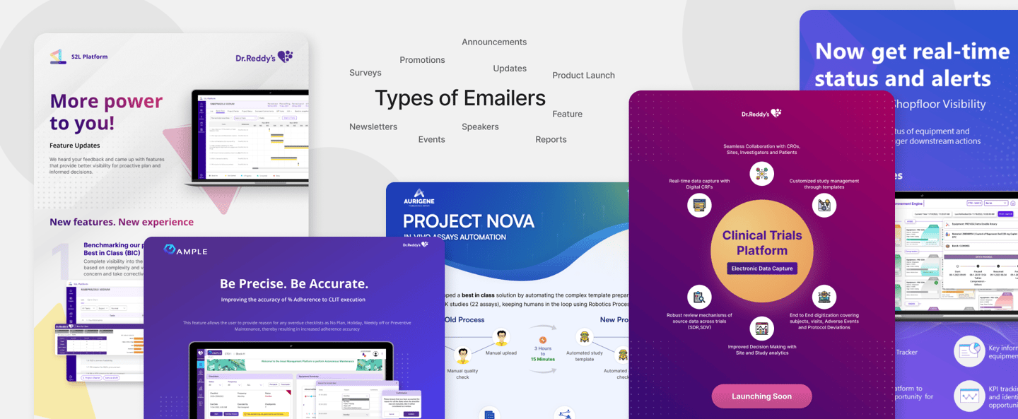
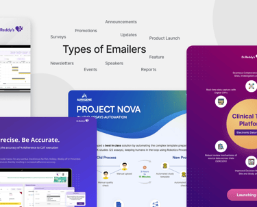
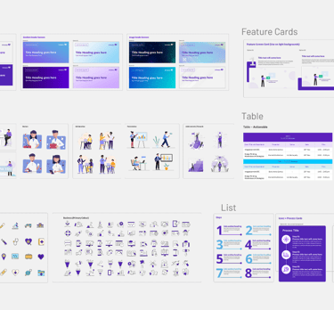
User-Friendly Components
Pre-designed icons, banners, illustrations, and mockups easily customizable within PowerPoint.
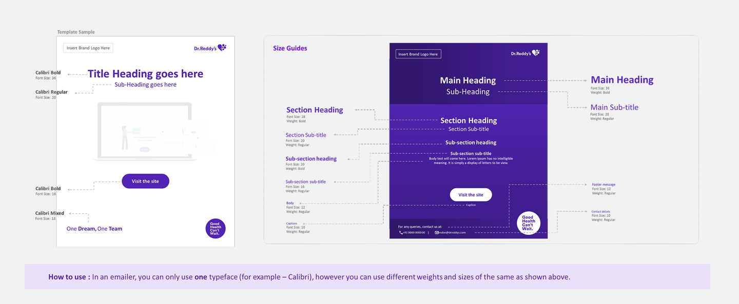
Clear Guidelines
Detailed, accessible usage instructions that eliminate guesswork and ensure accuracy.
Brand Consistency
A unified visual identity maintained across various communications, enhancing brand recognition.
Design Process
A structured four-phase approach — Discover, Direction Design, and Develop & Release — helped redefine insureka!'s user experience, turning insights into a smoother, more user-centric journey.
Direction
Design
Handover
Research
Exploring PPT Constraints & Possibilities
Atomic Breakdown
Structuring PPT Layout
Visual Design
Delivered system in PowerPoint
Component Designs
Testing & Feedbacks
Onboarding users
System Documentation


Direction
The Direction phase involved understanding stakeholder needs, aligning project goals, and establishing foundational guidelines. This phase defined the strategic approach and guided the creation of intuitive, structured templates tailored specifically for ease of use.
Atomic Breakdown
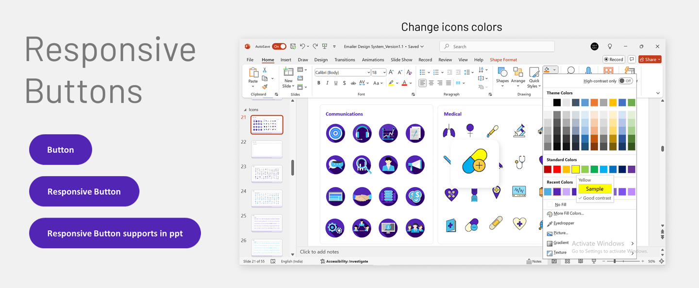
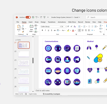
Applied atomic design methodology by breaking down emailers into fundamental components like text blocks, banners, headers, CTAs, and icons. These atomic elements formed the base for scalable, consistent, and reusable design patterns within the system.


Exploring PPT Constraints & Possibilities
Evaluated PowerPoint's capabilities and limitations for designing emailers. Identified formatting constraints, alignment challenges, and optimized usage of master slides, ensuring a smooth experience for non-design users without compromising on structure.
Structuring PPT Layout
Structured the entire design system into a single, collaborative PowerPoint document. Each section was defined clearly—headers, content blocks, icons, footers—with placeholder examples and instructions. This layout allowed cross-functional teams to plug in content collaboratively without design intervention.

Research
Conducted structured stakeholder interviews and thoroughly reviewed existing emailer communications to identify key challenges, requirements, and use cases. These insights guided the tailored development of design components and templates.
Design
The Design phase focused on creating a scalable, visually consistent system that is intuitive to use and aligned with the brand identity.
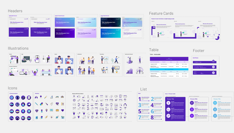
Component Designs
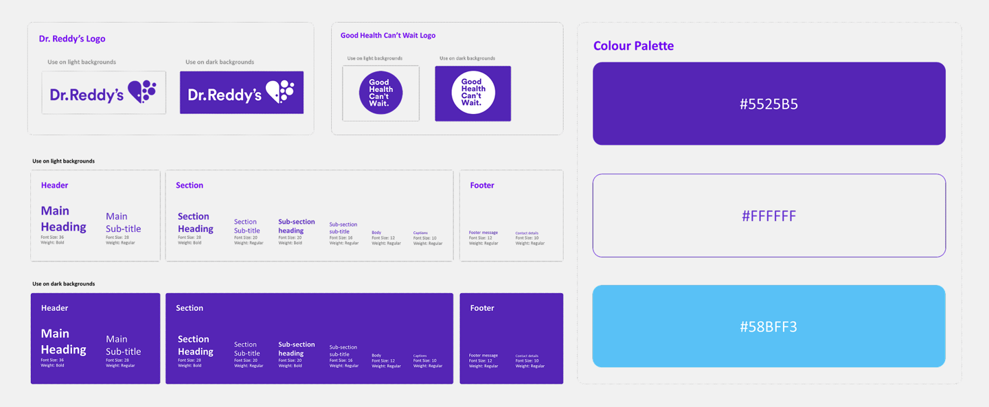
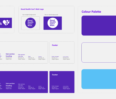
Crafted a comprehensive component library for both light and dark backgrounds, including CTA buttons, info banners, tables, headers, and icon sets. Each component was optimized for clarity, contrast, and flexibility across multiple emailer use cases.
System Documentation
Created in-depth instructions embedded within the PowerPoint system itself. Each section included clearly labeled examples, 'how-to' notes, and contextual usage tips to empower users with no prior design knowledge to confidently build consistent emailers.
Testing & Feedback
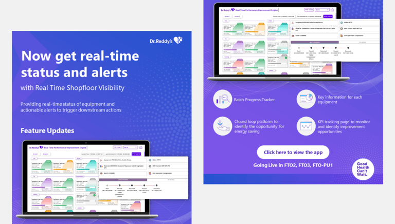
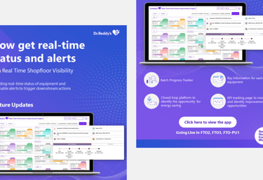
Finalized emailer samples were simulated using real content across multiple use cases such as events, product updates, and announcements.
Iterative testing was conducted with internal teams, leading to refinements in component sizing, layout structure, and ease-of-use improvements based on practical challenges shared by early users.
Visual Design
Established a cohesive visual system through carefully curated typography, brand-aligned color palettes, and adaptable layout patterns. Special attention was given to spacing, hierarchy, and legibility to ensure readability in both digital and print formats.
Handover
The Handover phase ensured that the emailer design system was not only delivered but also successfully adopted across departments. Focus was placed on making the system intuitive, accessible, and usable without design supervision. We facilitated knowledge transfer through structured delivery and walkthrough session.
Delivered System
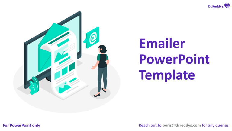
Shared the design system as a fully editable, master-structured PowerPoint template. It included pre-built slides, flexible components, embedded documentation, and visual guides to make self-service email creation seamless.
Onboarding users
Conducted department-specific live walkthrough sessions to introduce the design system. These sessions included guided tours, example walkthroughs, and Q&A interactions to ensure each team understood the workflow and could confidently adopt the tool in their day-to-day needs.
Team behind the system
This system was brought to life through seamless collaboration across design, product and content teams. Each individual played a key role in aligning goals, refining workflows, and enabling a scalable design system for everyday users.


Let’s connect
Feel free to reach out for collaborations or just a friendly hello 😀