Redefining insureka!
Led a full-scale UX/UI revamp for insureka!, a leading digital car insurance platform in Indonesia. Our mission was to align user needs with business goals through a cleaner interface, smoother flows, and a scalable design system.


50%
faster quote-to-purchase journey
100+
40%
User-Centric screens designed
Reduced development complexity
Problem Statement
The existing platform lacked a user-centric design approach. It featured overly complex flows, unclear navigation paths, and UI elements that were challenging to implement and maintain. This not only hindered usability but also strained development cycles.
Our Solution
We reimagined the experience with a user-first mindset — simplifying journeys, defining clear flows, and building a modular design system that’s intuitive for users and efficient for developers.
Design Process
A structured four-phase approach — Discover, Direction Design, and Develop & Release — helped redefine insureka!'s user experience, turning insights into a smoother, more user-centric journey.
Discover
Direction
Design
Develop & Release
User Interviews
Understanding Business & Product
Competitive analysis
Heuristic Evaluation
Information Architecture - Card sorting, site mapping & user flows
Website & Mobile Application
Design handovers
Mood Board & Mockups
Interface Design System
SEO Optimise Design
Tracking design performance through analytics
Evaluating Productions
Prototyping Flows
Visual Designs


User Journey Mapping
Affinity Mapping
Discover
Building a foundation through research and understanding
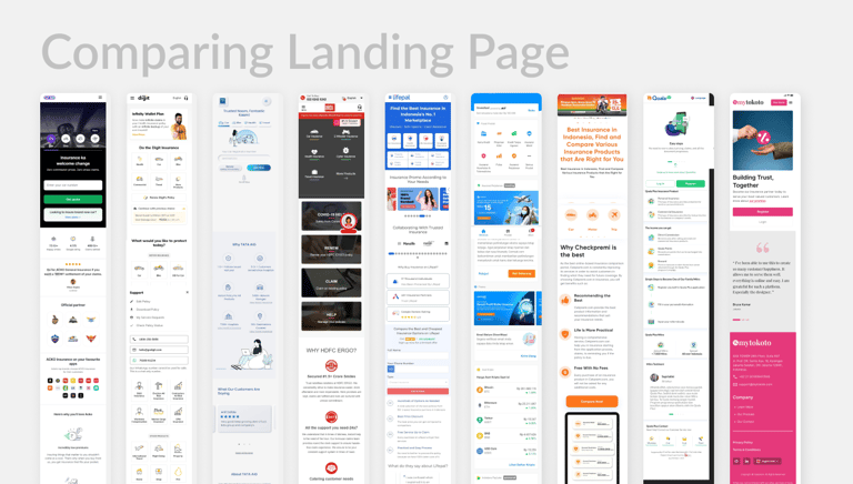
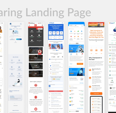
Competitive Analysis
Studied top insurance platforms (e.g., Qoala, Lifepal) to benchmark features, UX patterns, and onboarding processes. Identified gaps Insureka! could capitalize on.
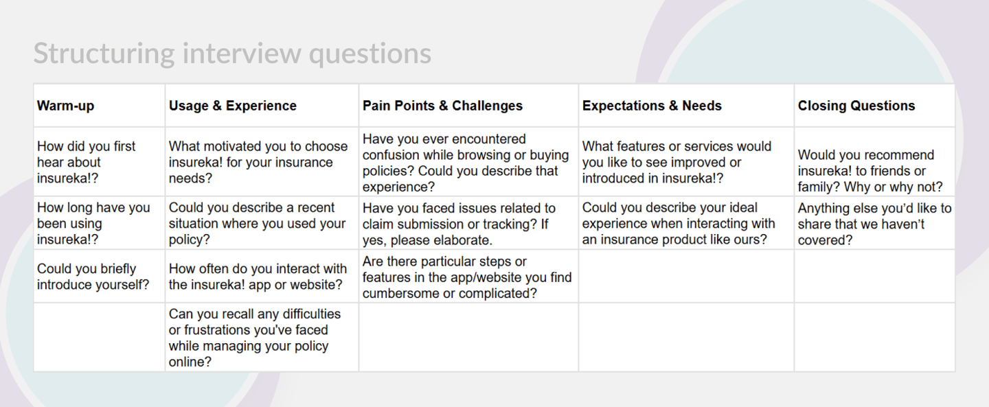
User Interviews
Conducted interviews with policyholders and first-time insurance buyers.
Affinity Mapping
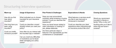
After conducting user interviews, competitive research, and internal workshops, we had a large amount of qualitative data. To make sense of this, we used affinity mapping to group related insights and uncover recurring patterns in user behavior, pain points, and expectations.
Affinity mapping helped us move from raw data to actionable insights. It laid the foundation for user personas, journey mapping, and prioritization of redesign efforts based on real user concerns.

Understanding Business & Product
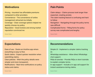
We ran a week-long workshop with business, product, and dev teams. Mind-mapping sessions helped us grasp the product ecosystem, identify pain points, and align everyone on shared goals.
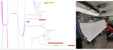
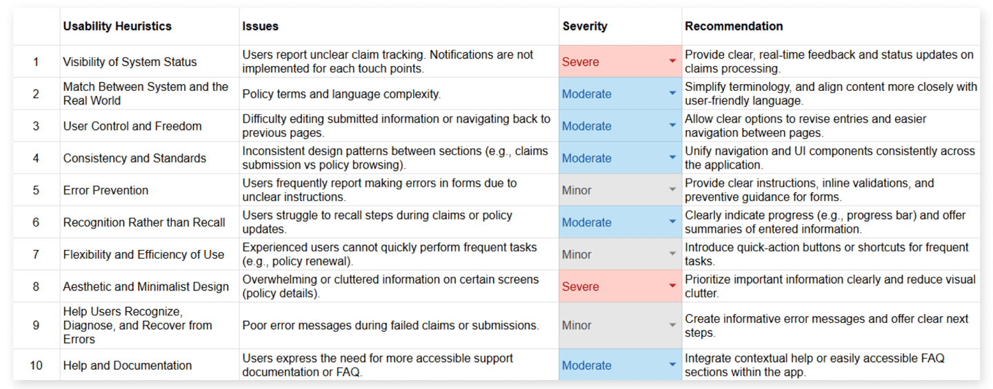
Heuristic Evaluation
Audited the existing website and app using Nielsen’s 10 heuristics. Flagged key usability issues like lack of feedback, inconsistency in language, and unclear CTAs.
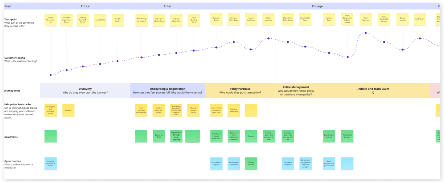
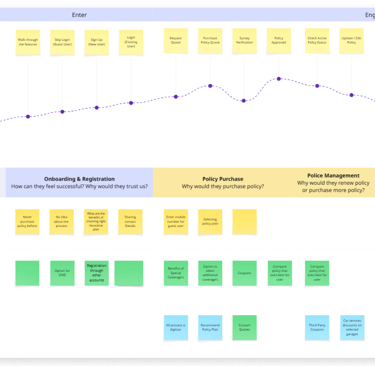
User Journey Mapping
To understand how users interact with Insureka! from start to finish, we mapped out the entire journey—from discovering the platform to purchasing a policy and managing claims. This helped us identify key friction points and emotional highs/lows in the user experience.
The journey map allowed us to pinpoint and prioritize UX issues at each touchpoint. It directly influenced the redesign of key flows, added reassurance elements (like status updates), and simplified interactions to reduce user fatigue.
Direction
Once we had synthesized all the research data, we moved into the Direction phase. This stage helped us define a clear design approach by aligning business objectives, user needs, and technical feasibility.
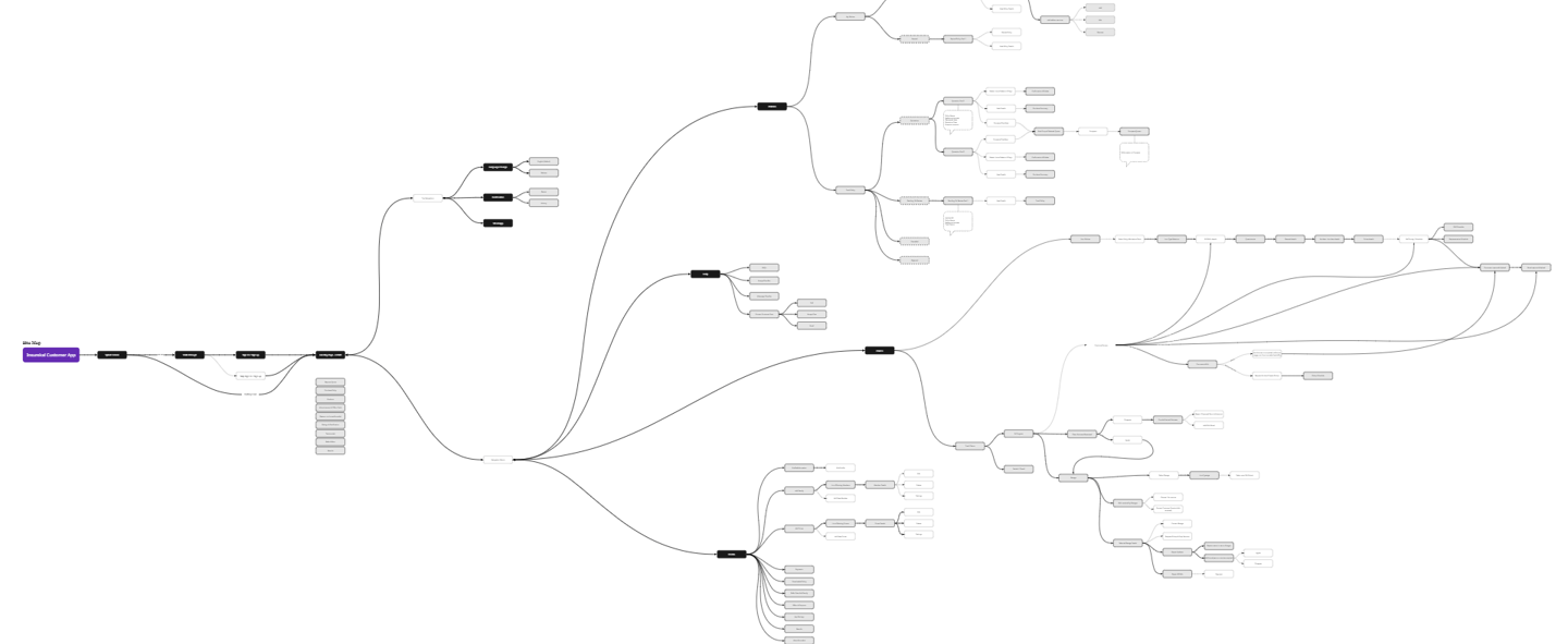
Site Mapping
A well-structured site map was designed to support seamless navigation and user tasks, focusing on both first-time visitors and returning customers.
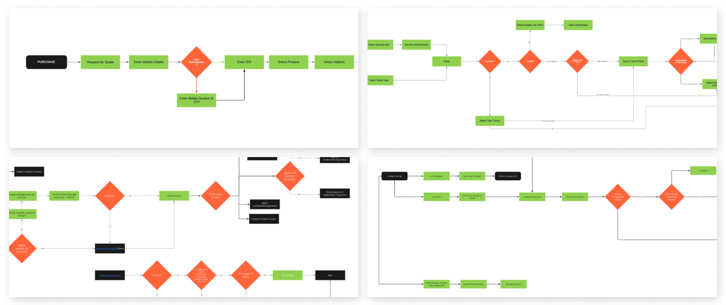
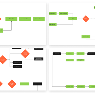
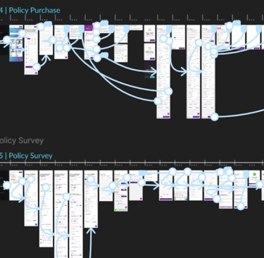
User Flows
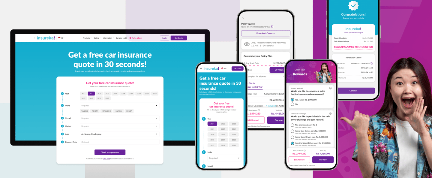
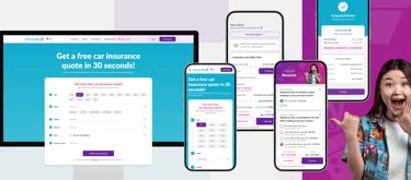
To ensure intuitive and frictionless navigation, we designed detailed user flows for all major actions users would take across insureka!’s web and mobile platforms. Streamline the user experience by mapping out step-by-step paths for key user goals. This ensured clarity, minimized dead ends, and helped align design and development teams early on.
Mood Board & Mockups
To establish a visual direction aligned with insureka!’s brand personality and target audience, we developed an initial mood board and created early mockups to validate the overall look and feel.
Create a clean, trustworthy, and modern visual identity that communicates clarity and ease-of-use—critical for an insurance product in a competitive market like Indonesia.
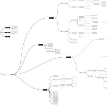
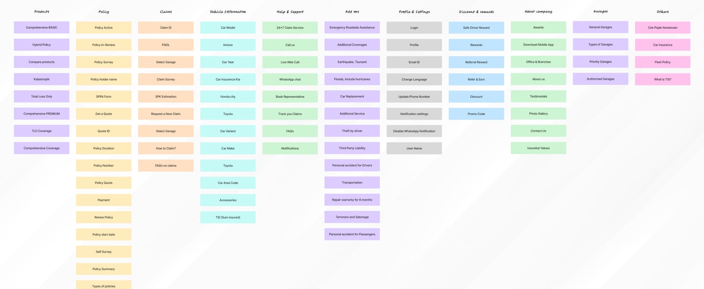
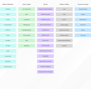
Information Architecture
A well-structured information architecture was essential to streamline navigation and reduce cognitive load across Insureka!’s digital platform. The new IA made the platform easier to navigate, reduced drop-offs due to confusion, and allowed users to complete tasks faster with fewer clicks. It also provided a clear foundation for scalable design and content expansion in the future.
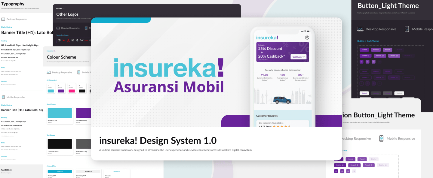
To ensure consistency, scalability, and efficient collaboration across product teams, we built a comprehensive interface design system tailored to insureka!’s brand and user needs.
Built a scalable design system in Figma: components, states, spacing, and accessibility. Maintained brand consistency across platforms.
Interface Design System
Card Sorting
To shape a user-friendly information architecture, we conducted internal card sorting exercises with cross-functional team members from design, product, and support. The internal card sorting helped us align the content structure with how teams internally envisioned the product being used. These insights guided the site map and navigation labels, ensuring intuitive paths for user actions.
Design
In the design phase, we translated research insights and strategic directions into tangible, user-centered interfaces for both web and mobile platforms. The goal was to create a seamless, visually appealing experience that makes insurance easy to understand and purchase.
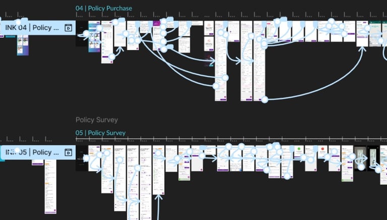
Prototyping Flows
Interactive prototypes were created to visualize key user journeys and test flow logic early. Using tools like Figma, we simulated navigation and interactions to identify and fix issues quickly. This helped ensure smooth transitions and clear user paths before development, improving communication and saving time.
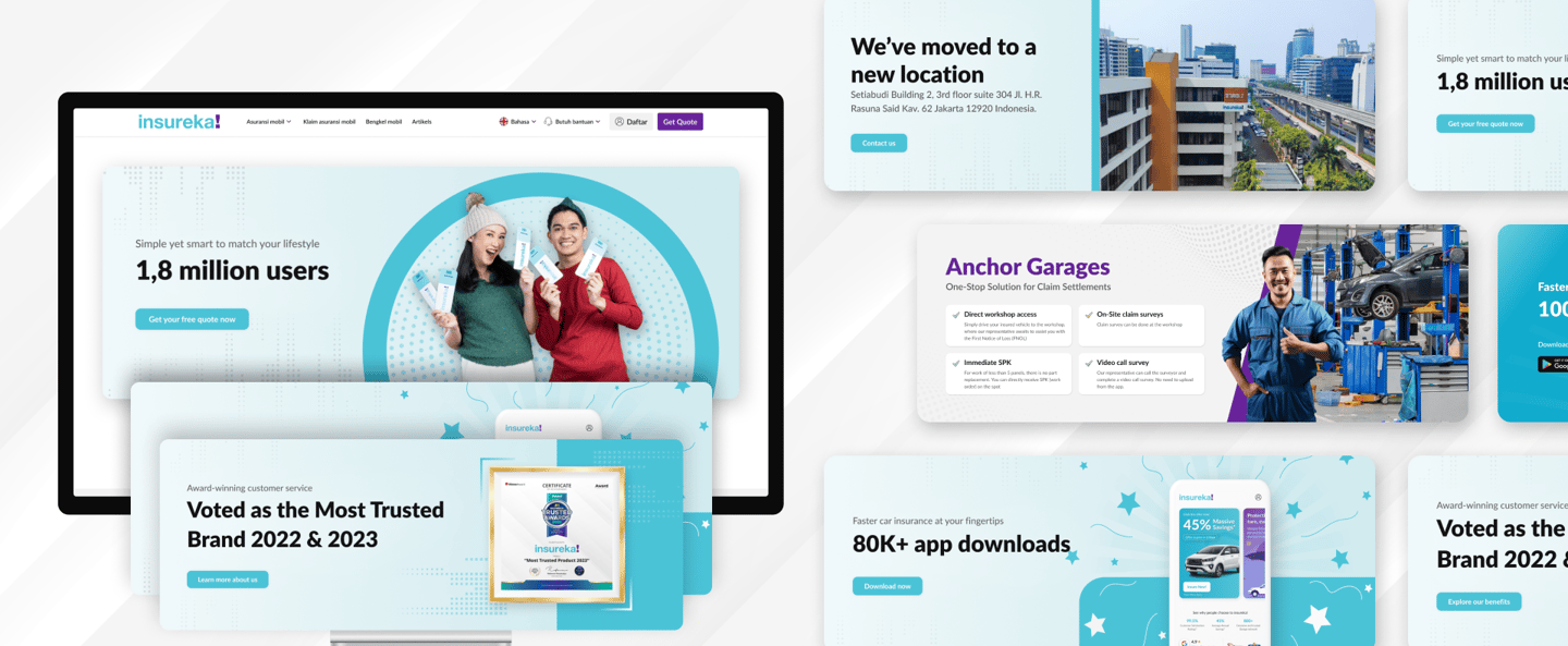
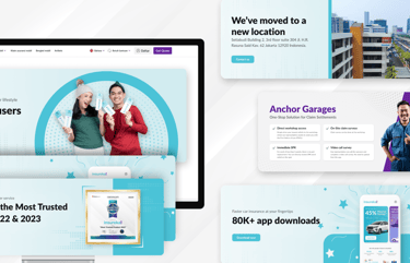
Visual Designs – Banners & Promotions
We designed eye-catching banners and promotional graphics aligned with insureka!’s brand style to highlight offers and key messages. These visuals enhanced user engagement and helped drive conversions by clearly communicating promotions across the website and app.
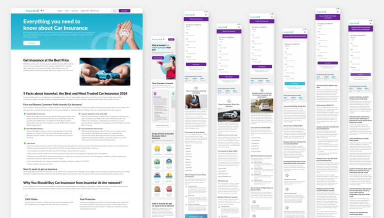
SEO Optimised Design
We collaborated closely with SEO experts and developers to ensure the design supported strong search engine rankings. By optimizing page structure, metadata, images, and loading speed—all without compromising user experience—we improved insureka!’s visibility and performance across devices.
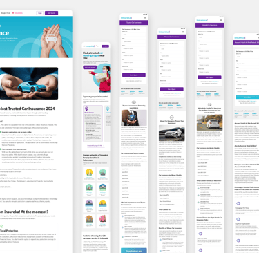
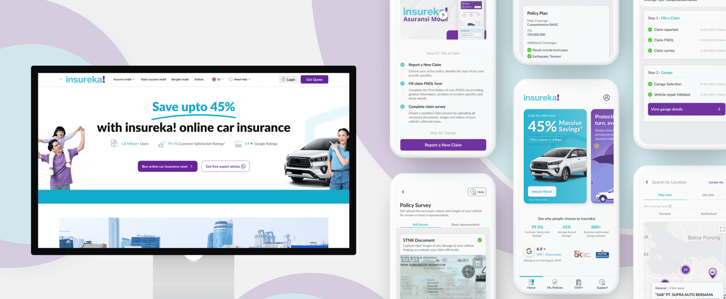
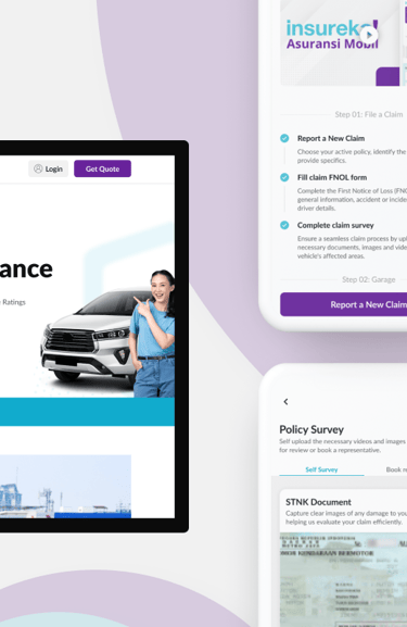
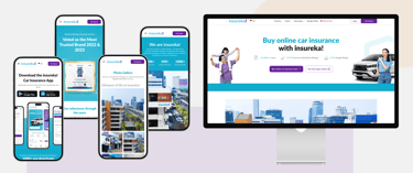
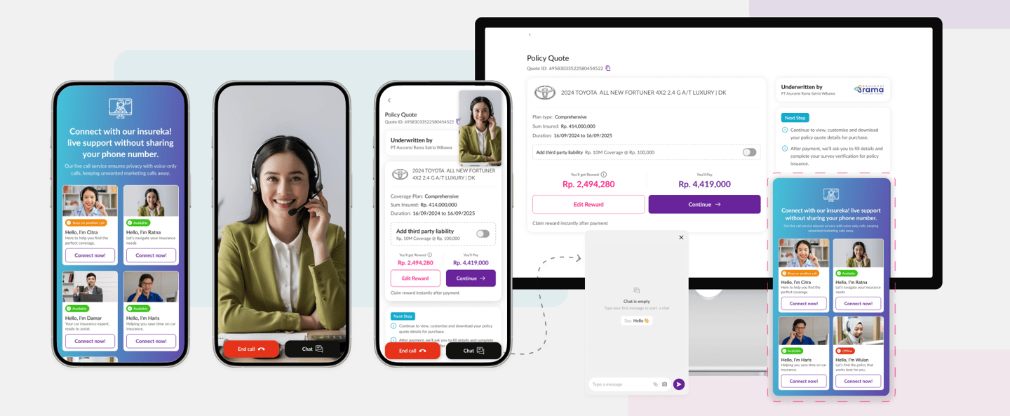
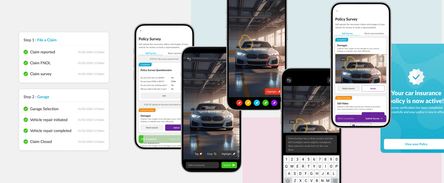
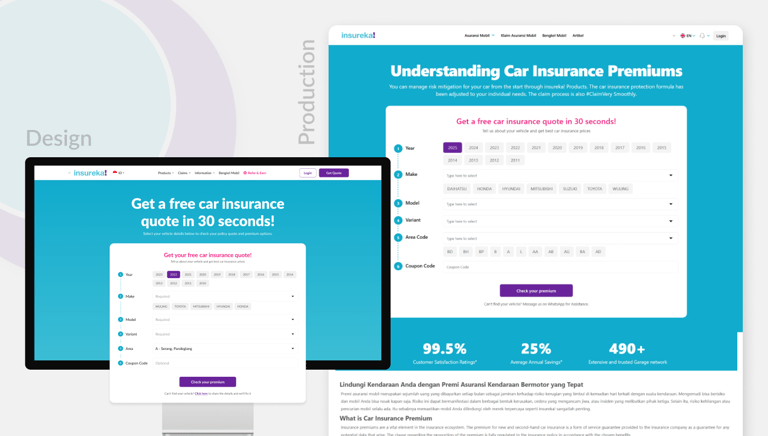
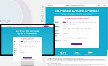
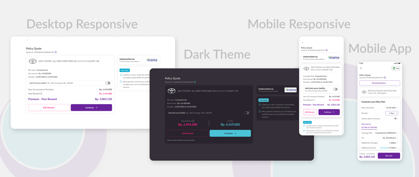
Website & Mobile Application
insureka! was designed with a mobile-responsive-first approach to ensure a smooth experience on all devices. The website offers clear, simple layouts with easy navigation and trust-building elements. The mobile app focuses on quick access to quotes, policies, and claims with touch-friendly, consistent design. Together, they provide a seamless, user-friendly insurance experience.

Develop & Release
During the Develop & Release phase, we ensured smooth design handovers by providing detailed specs and assets to the development team. Post-launch, we evaluated the live product’s performance and tracked key metrics using analytics to identify areas for continuous improvement and optimize user experience.
Evaluating Productions
After the product launch, we closely monitored the live designs to ensure they met quality standards and functioned as intended. We gathered user feedback and identified any usability issues or bugs, enabling quick fixes and improvements to enhance the overall user experience.
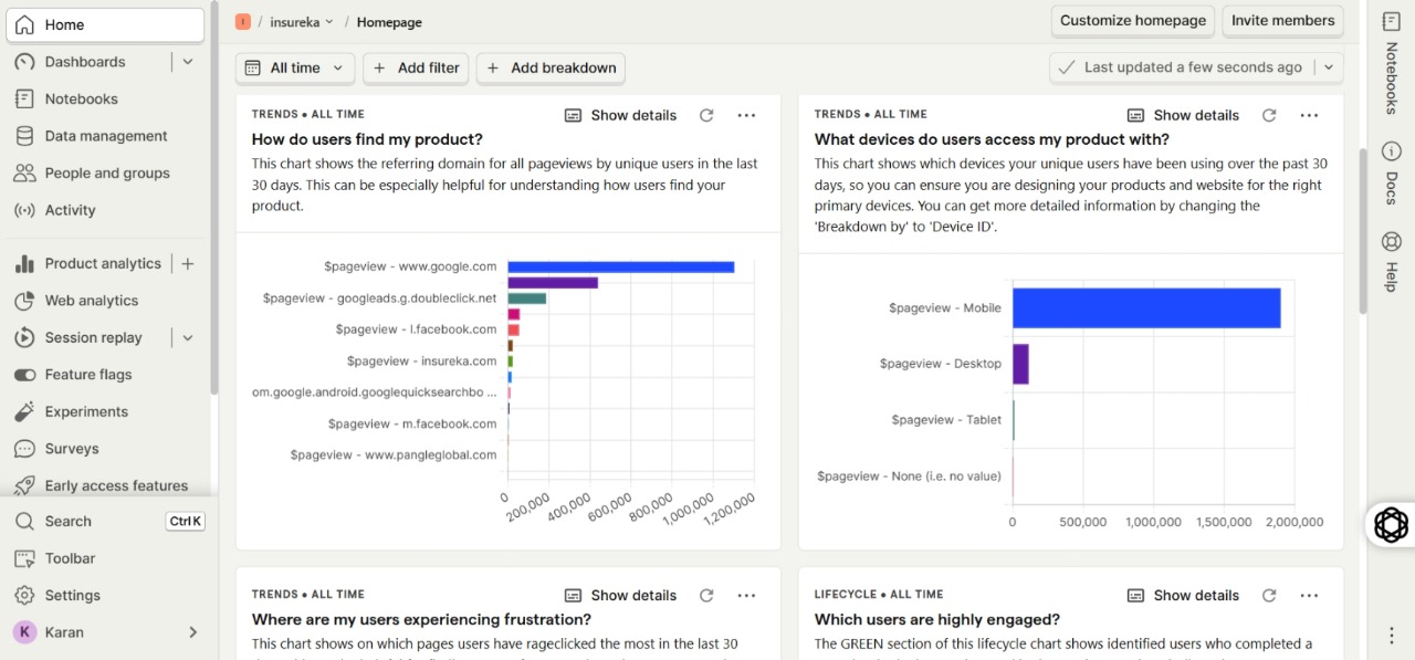
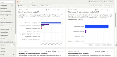
Tracking Design Performance
We tracked design performance using web analytics tools like PostHog to monitor user behavior, engagement, and flow efficiency. This data helped identify pain points, validate design decisions, and guided continuous improvements to optimize insureka!’s user experience and conversion rates.
Design handovers
After final approval of the mobile-responsive design, we translated the approved layouts into dark mode versions for desktop, mobile, and the app. Comprehensive design handovers were prepared, including detailed specs, style guides, and assets to ensure developers accurately implemented the responsive and dark mode designs across all platforms.

Glimpse while working
Here’s a behind-the-scenes look at my work setup and team moments during the insureka! project. From focused design sessions to collaborative brainstorming and fun team outings, these glimpses show the creative and supportive environment that helped bring the project to life.
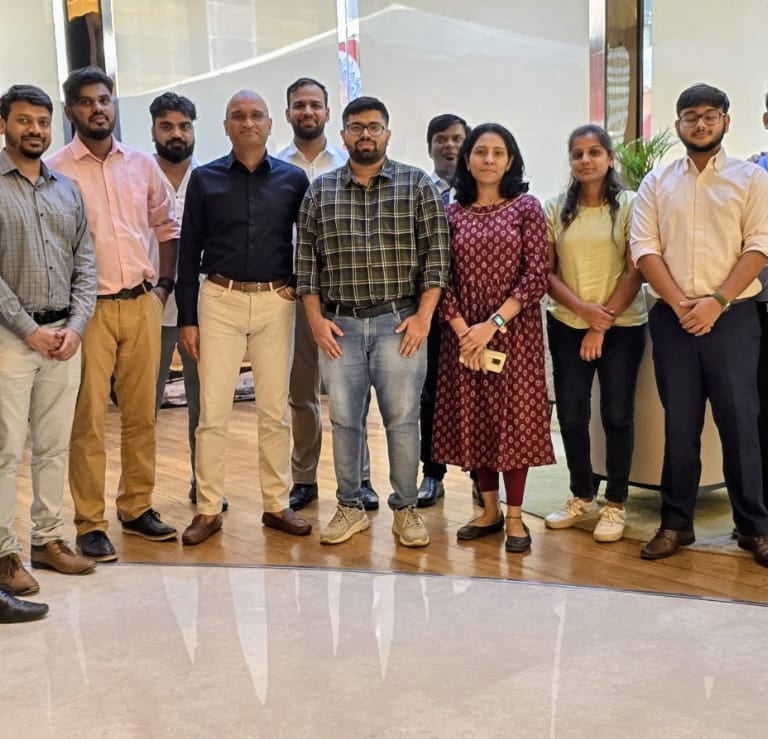
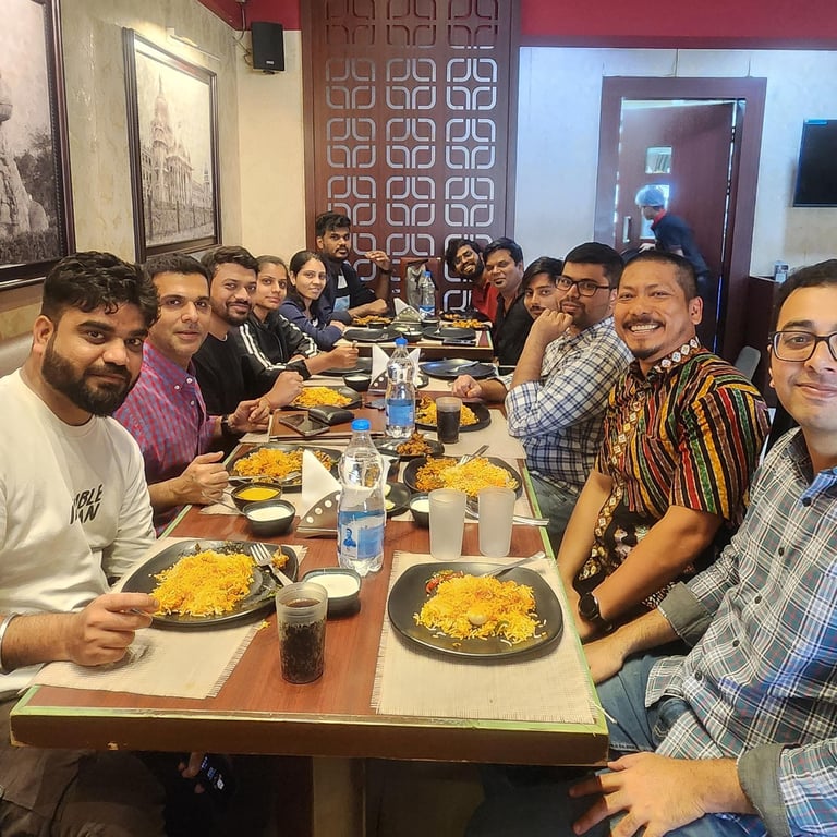
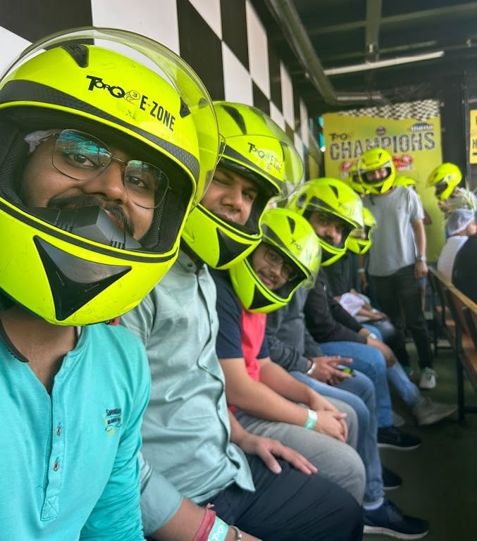
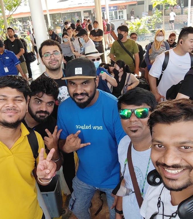
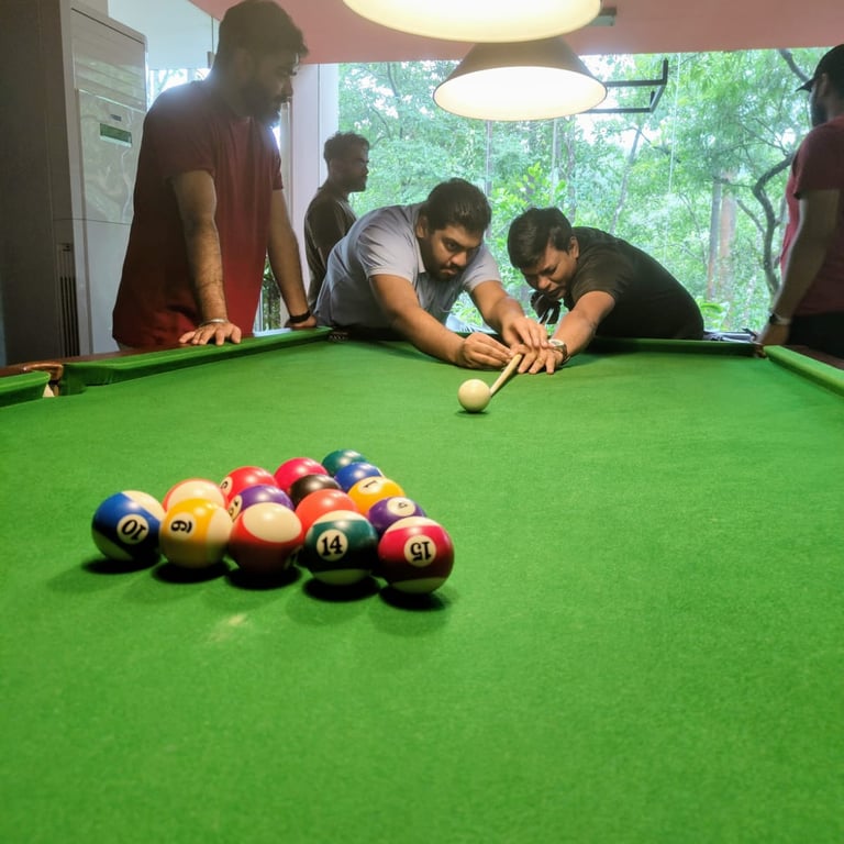
Team Moments
Team moments during the insureka! project weren’t just about work — we also shared fun times like team lunches, outings, and games. These casual hangouts helped us bond, recharge, and bring more energy and creativity to our design work.
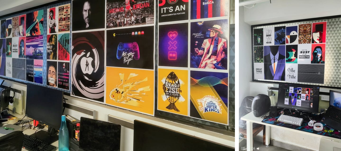
My Worksetup
My work setup for the insureka! project included a dual-monitor display for efficient multitasking, a high-precision stylus for detailed design work, and the latest design software like Figma for seamless collaboration. A comfortable, organized workspace helped maintain focus and creativity throughout the project.

Let’s connect
Feel free to reach out for collaborations or just a friendly hello 😀